Work Examples

Asurion

Asurion's primary business is mobile device insurance in partnership with major telecommunication providers across the globe. In addition, the company is involved with various direct-to-consumer lines of business including appliance repair and tech repair via a network of 800+ locations throughout North America. I've led the following initiatives while directing overall strategy and content operations for asurion.com.

CMS Migration

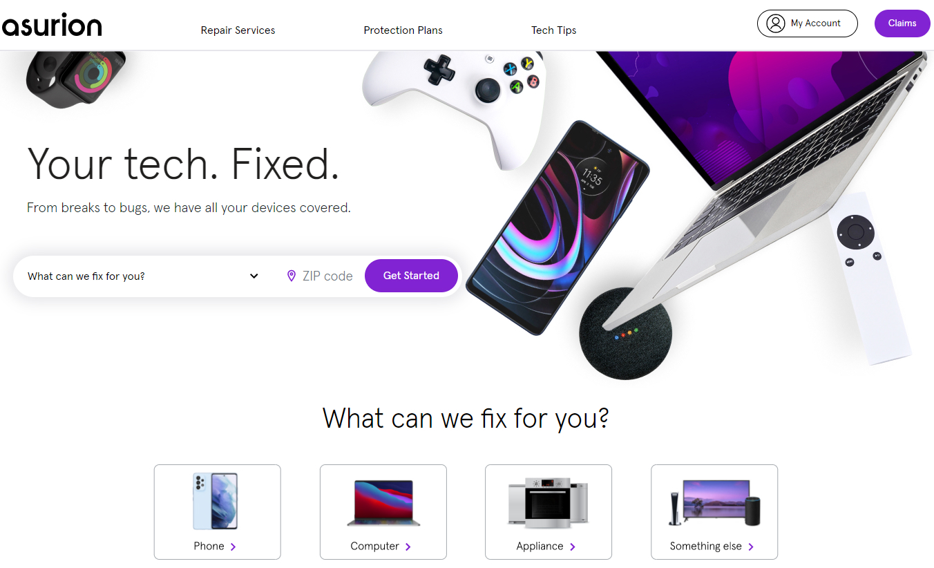
Asurion homepage

When I arrived, a project had just gotten underway to move the entirety of asurion.com off of an old WordPress instance to Contentful. I led a content development team, and took ownership of the product backlog to guide a larger Engineering group that delivered a new visual design, information architecture, and technical infrastructure. Nearly 1000 pages of fully re-designed and re-architected content were delivered in under 6 months, and the improved SEO from the migration raised sessions by over 50%.

Skills/Tools:Contentful, Optimize 360, HTML5, CSS3, Javascript, Google Analytics
Content Scaling

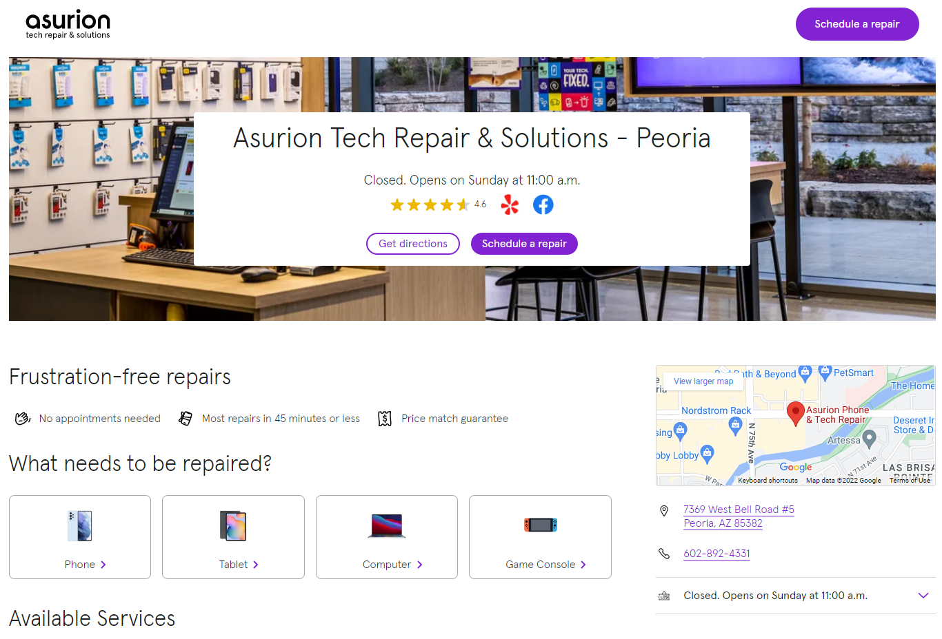
Asurion Location Page

Asurion acquired a network of tech repair stores in the U.S. and Canada with the name of uBreakiFix in 2019. In the fall of 2021, the company decided to rename these physical locations to Asurion Tech Repair & Solutions in an effort to increase brand awareness that would both grow direct-to-consumer repair efforts as well as the more traditional mobile and tech insurance business.

The previous name had a well-established domain authority in the SEO space so it was imperative that equivalent experiences were created quickly and efficiently on asurion.com, in order to smoothly transition the traffic.

I was tasked with figuring out how to do this, and in partnership with numerous groups throughout the company such as user experience, product, SEO, digital marketing, analytics, engineering, and retail executive teams, I led the creation of a holistic digital experience for customers seeking to engage with these rebranded stores on the company's site.

Just as important as caring for the customer experience, I also drove an innovative approach for building and maintaining this content in Contentful. The result was over 11,000 pages of store-related content that could be efficiently managed at scale by authors, with very little involvement from Engineers.

Skills/Tools:Contentful data modeling/templating

UScellular®

The examples that follow are a snapshot of work I directed to completion while leading all user experience, graphic design, and front-end development of the site for UScellular, a $4B cellular service company with roughly 5 million customers. The overall architecture was built in mid-2010, prior to wide-spread industry use of HTML5/CSS3 and Responsive Design. Please note that the state/content of the pages on the live site will change over time from what you'll see below.

The most challenging aspect of managing the e-commerce experience for a wireless company is enabling shopping for non-traditional e-commerce products. Consider the complexity that goes into selecting all of the aspects of a multi-line wireless account. In a retail setting, a salesperson can walk customers through the vast array of choices. In a digital setting, despite robust support tools and chat, all of that complexity has to be abstracted as much as possible to encourage customers to convert on their own.

Strategy

Mobile Apps

Mobile App Strategy

E-commerce had been an isolated group at UScellular for some time until an enterprise initiative brought other departments into a stakeholder role for the company's online presence. As part of a large, multi-year technology transformation project, UScellular's first app was set to be developed.

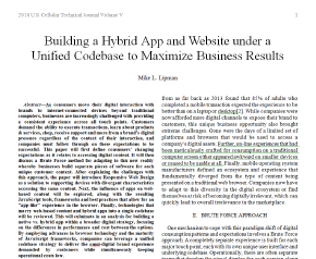
Given the relative newness of the space to other groups, I took it upon myself to draft an academic paper on the topic of app creation for inclusion into the company's yearly technical journal. This marked the first time that an associate outside of the IT or Engineering departments put forth an entry.

The paper discusses the business benefits of leveraging a single front-end codebase to construct both a responsively designed website and a hybrid app. I combined my expertise on the technical and business sides of e-commerce by laying out the technology path to deliver on the thesis as well as a detailed NPV analysis that demonstrated its cost savings.

Responsive Design

Responsive Web Design Strategy

In an effort to increase awareness of the benefits that Responsive Web Design (RWD) could bring to the organization, I created an engaging presentation to explain the concept to senior leadership.

UScellular's mobile site is only optimized for display on traditional phones (i.e. not tablets) in its current state, with limited account management functionality and no e-commerce enablement. I felt there was a sense of urgency, not only to match robust offerings in the mobile space from competitors, but also to ensure that the company delivered digital experiences that its customers demanded.

In the presentation, I strove to explain the concepts behind RWD in business terms, focusing on the financial benefits and cost savings of the methodology as opposed to technical jargon. And given that I would be the one responsible for implementation, my goal was also to make clear the sacrifices and costs that would have to be made to complete the project.

Leadership in Design & Development

Home Page

UScellular Home Page

I created the initial HTML4/CSS2 layout and coded the pieces of dynamic functionality (like the hero carousel and social media API integration). Graphic designers on my team and copywriters provided the images/copy based on current promotions, company branding, and SEO considerations.

The page's content reflects a delicate balance in working with multiple stakeholders throughout the company. All product managers want their content front and center, so a keen awareness of the business benefit of each is necessary to determine prioritization within the page's limited real estate.

Skills/Tools:HTML4, CSS2, javascript, jQuery, Carousel plug-in, Social Media APIs, Photoshop

My Account Dashboard

UScellular My Account Dashboard Page

Due to the wealth of information on a customer's mobile account, proper organization of the data is a critical component to a dashboard's UX. The technical challenge involved surfacing that data, which was spread out over 10+ service calls, in an efficient manner.

The first step involved the HTML4/CSS2 page scaffolding and creating the JSON request/response structures with the back-end team. Next, I packaged the AJAX service calls in logical bunches. Calls within a bunch execute in parallel while the bunches themselves fire off in series, with precise logic to mediate the dependencies between calls. Finally, I coded complex logic to handle the 50+ different data scenarios for customer accounts.

This last piece required an in-depth understanding of business goals. USCC's customers are on a wide variety of plan structures and it was imperative that customers on lower value plans were presented an experience that funnelled them into a more profitable set of services.

Skills/Tools:HTML4, CSS2, javascript, jQuery, AJAX, JSON, Axure

Usage Details

UScellular Usage Details Page

The ability for mobile customers to monitor their usage is one of the most critical functions of online account management. Cellular plan structures have historically set limits on voice, messaging, and data, so customers find overage charges highly undesirable.

The critical UX component was a visualization of the usage in graphical form. It wasn't enough to simply show that, for instance, a customer has used 500 out of 1000 minutes on their plan in the current month. It was important to show how that usage corresponded to where they were in their billing cycle as well as what line on their account may be incurring a disproportionate amount.

The gas gauges were a custom implementation that I developed on top of the standard HTML4/CSS2 scaffolding. gChart was leveraged for the pie chart visualization, taking the result of AJAX-based server calls returned in JSON format.

Skills/Tools:HTML4, CSS2, javascript, jQuery, gChart, AJAX, JSON, Axure

Device Listing

UScellular Device Listing Page

While the cost of service plans is what tends to differentiate mobile carriers, the devices they carry garner a majority of the shopping attention. A re-design of the product listing page for devices was needed as a result of complex rules that the promotional team had been using, as well as to fully feature the amazing new products that manufacturers had been releasing.

Due to its extremely high visibility and overall complexity, much time was spent wireframing in Axure and getting buy-in from business stakeholders. Once complete, I first built the JSON structure and worked with the back-end team to implement based on the data in the product catalog. I then hand-coded the entire javascript/jQuery solution, including an innovative compare feature that leaned on jQuery animation for a dynamic feel.

Skills/Tools:HTML4, CSS2, javascript, jQuery, AJAX, JSON, Axure

Device Detail

UScellular Device Detail Page

The product detail page for devices needed a similar refresh to the listing view in order to incorporate new promotional rules and highlight features.

Because the detail pages were frequently used as the landing page for SEM ads and social media posts, its SEO impact was high and necessitated a different scaffolding approach. I had coded the listing view such that jQuery was responsible for building the page, however the detail page required the JSP layer to build most of the page structure. This required extensive partnership with the back-end vendor (Accenture).

I leveraged the jQuery Galleria plug-in to create an interactive lightbox media gallery. Along with this, I led the effort to bring product photography in-house, saving the company thousands of dollars per device and allowing us to show innovative images such as size comparisons with people's hands and everyday objects. Finally, I coded a custom solution to feed in ratings & reviews (from BazaarVoice) and show social "likes" from a variety of sites.

Skills/Tools:HTML4, CSS2, javascript, jQuery, Galleria plug-in, Social Media API integration, Axure

Plans Listing

UScellular Plan Listing Page

Cellular service plans represent a unique UX challenge to purchasing on-line. They aren't like traditional products and often have complicated business rules that restrict the options available to consumers.

Prior to cellular companies going to a model in which voice and messaging are unlimited and only the data amount used by the account is an option, data was chosen at the individual line level and the number of minutes chosen at the account level. With this structure, I designed and coded the interface for customers to select their plan — whether they wanted a single line account without data or a 6-line family plan with different data amounts per line.

First, I developed the JSON structure that could handle all of the variability. After instructing the back-end team in how to query the product catalog to produce that structure, I built all of the javascript/jQuery code to perform the heavy lifting of page construction using that data. jQuery animation was used to allow customers to make a series of choices all on one page in an intuitive and organized manner.

Skills/Tools:HTML4, CSS2, javascript, jQuery, AJAX, JSON, Axure

Shopping Cart

UScellular In-Page Shopping Cart

The most challenging UX aspect of selling cellular service on-line is how to orient the customer as they're building their cart. Unlike a traditional e-commerce experience, all of the product choices relate to one another, with some combinations prohibited while others are promoted to achieve business goals. The complexity is even more daunting for current customers since the variability of products on older accounts is so high.

I designed and coded a unique modal treatment that served to orient the customer as the multi-step conversion funnel was being completed. After every add to cart, the current state is updated with a complete look at the order and amounts due today/monthly.

After getting buy-in from senior leaders using Axure wireframes, I developed the JSON structure and directed the back-end team on how to produce it based on the cart's state. Next, I coded the complex jQuery that synthesized all of the JSON data into a consistent, usable experience.

Skills/Tools:HTML4, CSS2, javascript, jQuery, AJAX, JSON, Axure

Mobile Site

UScellular Mobile Site

Funding was unavailable to engage in a full Responsive re-design of U.S Cellular's web properties in 2012 so a dedicated mobile site (m-dot) was commissioned.

In partnership with Razorfish, my team and I deployed the company's first mobile-optimized site, which represented a slimmed-down version of the desktop site. Its primary purpose was to show the devices and plans the company offered while having a quick way to get answers to support questions. Over time, it expanded to included a mobile-optimized My Account area, which offered a sub-set of the functionality on the desktop site.

I led the efforts in engaging with Razorfish to build out these sites. My primary role involved educating the vendor team in how the products and services were sold and any nuances that had to be considered. I also oversaw the technical implementation of the front-end mobile architecture, and hired staff to be able to support the site once it was in production.

Skills/Tools:Axure, HTML5, CSS3, Bootstrap 2, javascript, jQuery

Re-branding

UScellular Re-branding

In 2012, UScellular's new CMO implemented an enterprise-wide re-branding initiative. The main color palette completely changed and numerous branding elements, including photography, typography, and tone were significantly altered.

With only a few weeks notice until launch, I led the effort to re-skin all of the company's web properties. Making things more challenging was the fact that digital guidelines had to be created on the fly in partnership with the agency of record (Mullen).

I changed thousands of lines of pure CSS2 (unfortunately no LESS or SASS was in use) and engaged with the testing team in the laborious effort of verifying the 6 browsers variants supported on all pages of the site (IE8, IE9, IE10, Safari, Chrome, Firefox).

Skills/Tools:CSS2, Photoshop

Static Page Creation

UScellular Static Page

Not all of my work at U.S. Celllular has required such extensive efforts in building out robust jQuery-driven dynamic pages with AJAX calls and JSON structures passed back and forth.

In a broader strategic move to focus more on small and medium-sized business customers, U.S. Cellular commissioned Razorfish to re-think the digital presence for that customer segment. I worked extensively to educate the vendor on the product rules for selling to that group of customers as well as the technical architecture of the web ecosystem.

They were only on the project to produce the page design so I took their pixel-perfect PSDs and created the equivalent look/feel on a working web page, integrated with the content management system and e-commerce platform (ATG).

Skills/Tools:HTML4, CSS2, Photoshop

Other Examples

Bracket World

Bracket World Home Page

I built this as a fully responsive site and companion app dedicated to creating and playing in tournament brackets. Users can create brackets for any sized tournament, define the teams and number of points for a correct answer per round, and share with either a few friends or the whole world.

An intuitive bracket creation and team selection interface allows users to make their picks with ease. Bracket owners update the winners which automatically scores and ranks all participants of that bracket.

Skills/Tools:Originally built using a traditional AMP stack — HTML5, CSS3, Bootstrap 3, javascript, jQuery, AJAX, JSON, LESS, SVG, PHP, Relational DB Design, MySQL, Photoshop, GreensockJS (animation for large-screen home page), Apache (via GoDaddy).

Completely rebuilt using a MEAN stack — MongoDB, Express, AngularJS, NodeJS, SASS, Grunt, Adobe Build, Cordova, DigitalOcean (host), Android App Development, iOS App Development

Bracket World jQuery Plugin

Bracket World jQuery Plug-in

I created this to allow jQuery developers to inject a customizable, SVG-based bracket structure into their own sites using a standards-based plugin.

An API is exposed for visual manipulation of the bracket after initial creation and devs can configure up to 12 separate options — all documentation and source code is available on GitHub.

Skills/Tools:HTML5, CSS3, Bootstrap 3, javascript, jQuery, SVG, JSON, GitHub, jsFiddle.

Personal Site

Personal Site

The current site you're viewing, which I use as a platform to try new front-end techniques as I become aware of them.

I've historically experimented with Grunt and its associated plug-ins during the test and build process. Zurb's Foundation 5 was used as the RWD framework with SASS customizations. On the javascript side, parallax coding techniques are employed on the home page (only for screens 1024px+ x 540px+).

Skills/Tools:HTML5, CSS3, javascript, jQuery, Foundation 5, SASS, PHP, Photoshop, Grunt, Node